
Tried putting some characters into the backgrounds to see what it looks like. I'm starting to get the feeling that I almost know what I'm going to be doing. Its quite reassuring, it doesn't feel like I'm stumbling around in the dark anymore.
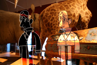


I quite like the background showing through but only if its clear enough for the audience. Which looks better? Dark or light?
The dark seems to be more dominant, but think the light is better, more conventional drawing line, the dark looks like a neg version
ReplyDelete